
Typography is not just about arranging text; it’s an art form that conveys personality, emotion, and meaning. Fonts act as visual storytellers for your brand, speaking volumes about who you are before a single word is read. Whether you aim to be playful, authoritative, or innovative, the right typeface can set the stage for your brand’s story.
Let’s explore how fonts evoke emotions, how to align them with your brand’s identity, and why they play a pivotal role in forming lasting connections with your audience.
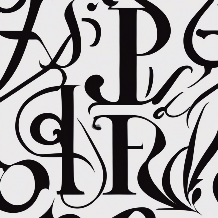
The Hidden Psychology of Fonts
Fonts are a lot like human speech—they have tone, style, and personality. Each font category communicates different subconscious messages to the viewer. This is why choosing the right typeface isn’t just a design decision; it’s a strategic move to position your brand effectively.
- Serif Fonts
Serif fonts have decorative “feet” or strokes at the end of letters, giving them a classic and elegant charm. They evoke feelings of trust, tradition, and reliability.- When to Use Them: Ideal for formal, professional, or historical brands, like newspapers (e.g., The New York Times), luxury goods, or law firms.
- Examples: Times New Roman, Garamond, Baskerville.
- Sans-serif Fonts
Sans-serif fonts are clean and modern, with no decorative strokes. They are minimalistic, approachable, and often associated with forward-thinking brands.- When to Use Them: Perfect for tech companies, startups, and brands emphasizing simplicity and innovation (e.g., Google, Spotify).
- Examples: Helvetica, Arial, Open Sans.
- Script Fonts
Script fonts mimic handwriting, often exuding elegance, creativity, and personal touch. They are playful yet sophisticated.- When to Use Them: Suitable for wedding invitations, artistic endeavors, or premium branding (e.g., luxury cosmetics).
- Examples: Pacifico, Great Vibes, Lobster.
- Display Fonts
Display fonts are bold and attention-grabbing, often used for headlines, logos, or campaigns. They help brands stand out and exude a sense of uniqueness or audacity.- When to Use Them: For creative campaigns, movie titles, or fashion brands looking to make a statement (e.g., the Coca-Cola logo).
- Examples: Impact, Bebas Neue, and highly decorative custom fonts.
How Fonts Enhance Your Brand Story
Every interaction with a brand is part of a broader story. Fonts play a pivotal role in shaping how audiences perceive and connect with that story.
- First Impressions Matter
The typeface you choose immediately sets the mood. Consider seeing a tech-focused brand with an elaborate cursive font—it might feel out of place. That’s because the font doesn’t align with the audience’s expectations for clarity and modernity in tech. Fonts must resonate with a customer’s first impression of your values. - Consistency Builds Trust
When the same fonts are consistently used across all brand touchpoints—such as your website, packaging, and ads—it creates a cohesive and professional image. People subconsciously recognize and trust brands that are visually reliable. - Eliciting Emotional Connections
Do you want to inspire happiness, trust, or prestige? Fonts can steer emotional reactions without people even realizing it. For example:- Round, friendly sans-serif fonts (like Comic Sans) feel approachable but might not suit a luxury brand.
- Minimalistic sans-serif fonts like Montserrat make modern brands feel sleek and progressive.
- Becoming Memorable
Unique typography enhances brand recall. Think about Coca-Cola’s iconic script font. Even if the logo’s color were changed, the typeface alone would make the brand instantly recognizable.
How to Choose Fonts That Align with Your Brand
Selecting fonts for your business requires more than aesthetic preference. There’s a strategic process behind it:
- Identify Your Brand Identity
Begin by defining your brand values. Are you youthful or traditional? Are you dynamic or composed?- Examples:
- If your brand represents trusted heritage, serif fonts may be best.
- If your goal is to feel tech-savvy and future-forward, sans-serif fonts work well.
- Examples:
- Understand Your Audience
Fonts resonate differently with various demographics. A playful font might click with a younger audience but alienate an older, more professional demographic. - Balance Creativity and Readability
Creativity shouldn’t come at the cost of readability. Script fonts might look artistic, but overusing them in blocks of text reduces clarity. - Pair Fonts Strategically
Use a combination of fonts (no more than 2-3) to create visual contrast yet maintain balance:- Example: Pair a bold, sans-serif header with a refined serif body text.
- Test Across Platforms
Ensure your fonts look good in different sizes, on various devices, and across all mediums—whether digital screens, printed brochures, or signage.
Case Studies: Fonts in Action
- Coca-Cola
This iconic brand uses a custom script to convey timeless joy and nostalgia. Its font is instantly recognizable and emotionally evocative, making every product feel like a piece of history. - Spotify
Spotify embraces sans-serif fonts like Gotham to signal innovation and simplicity, aligning with its cutting-edge and user-friendly music streaming service. - Vogue
Vogue’s serif fonts exude elegance, authority, and high fashion. The typography effortlessly reflects its premium, style-focused identity.
Evolving Your Fonts Over Time
Brands evolve, and so should typography. Font choices that were trendy five years ago may not resonate with today’s audience. For example, Google updated its logo from a serif to a simple sans-serif font to adapt to the minimalist design era.
Stay alert for typography trends, but don’t follow them blindly—always ensure your fonts align with your brand’s core identity.